Shake hands? Yes. Introduce yourself? Yes. Try to remember the other person’s name for when you get to the end of the conversation? Double yes.
But one of the most important things to do in any business exchange is to present your business card to the other person. Why? Because business cards are the perfect way for someone to easily get in touch with you again, and, depending on how your card looks, will leave a lasting impression on the person.
If your business card looks like it was drawn with a crayon on top of a 2″ x 2″ corner of last night’s pizza box, then here are some tips to update it, and get people interested in the services you have to offer them.
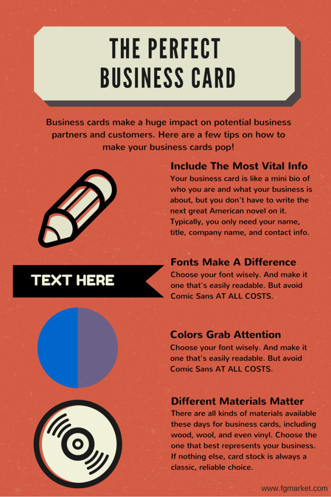
Include the Most Vital Info
Your business card is like a mini bio of who you are and what your business is about, but you don’t have to write the next great American novel on it. Sure, you need to include enough info that your business isn’t wildly ambiguous, but typically you only need 4 -5 bits of info. The most important info to include are your name, title (CEO, writer, manager), your company name, and your contact information (which can include phone number, email, and maybe even your mailing address).
Fonts Make a Difference
When selecting the typography for your business card, always make sure it’s easily readable and font is large enough to make an impact. Most of the time, sans serif fonts are the best to use because they’re simple, clear, and easy to read. Use sans serif fonts like Helvetica or Swiss for your contact info. But your company name needs to be a little flashier, so feel free to use any font that’s both flashy, and easy to read. But whatever you do, avoid using Comic Sans. If you’re struggling with Comic Sans addiction, consider visiting this site: www.comicsanscriminal.com.
Colors Grab Attention
Colors can be just as important as your typography. Make sure if you use a solid color background that it’s a color that works well with the font style and font color that you choose. Using a yellow background with a white font is typically bad news, but a black background with white font helps to make your font standout much better. And it’s a good idea to stick with CMYK colors when designing, since these colors are better for printing projects. RGB colors are better for websites and screens.
Different Materials Can Impress
Most of the time, business cards are printed on cardstock, with varying thicknesses and quality. But now there are so many options for different materials that you can use to make your business cards pop.
You want the material you use to reflect the business you’re in. For example, a carpenter, woodworker, or construction company owner might get his business info printed on different types of wood. If you’re in the fashion or clothing industry, you might want to get your cards made out of leather or wool. Or, if you’re a DJ, record store owner, or music producer, you can even get your cards printed on vinyl record material. There are so many options out there, but the traditional paper business card is the most reliable and cost efficient if you’re just starting out with your business.
Business cards are great tools, but you gotta know how to use them properly in order to make an impact on your next business partner or customer. I’m gonna say it again: don’t use Comic Sans. Please. I’ll come find you if you do.

